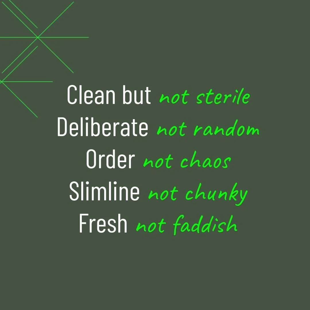
Not just a pretty (new) face.
Over the past 3 months, Laura and I have been partnering with the brand and design legend that is Dylan Truscio from Loppy, to update our brand identity and then apply it to all of our customer-facing touchpoints (most notably our website). It goes without saying that we’re over the moon with the final result- but it’s been a great reminder for us of how thoughtful you need to be if you want your visual identity to work as hard as you do to bring your brand essence and intent to life. It’s a game of first and lasting impressions- every aspect of your brand identity sends cues to the outside world about the way you view yourselves, and the way you want to be perceived. So jumping straight to choices about colours and icons isn’t an option if you want your brand to be more than aesthetically pleasing- it should be a highly strategic process.
Here’s a few of the challenges we encountered along the way- even as strategic marketing experts!
Separating yourself from the brand
Wingmaven is our baby. We gave birth to this precious entity over 18 months ago, and have carefully nurtured it ever since. We’ve grown fast- and much of that early success was as a result of our individual professional reputations. And we’re a services business, which means so much of our brand identity is inextricably interlinked with the way Laura and I carry ourselves in market. But we’re at a different stage in our growth now. We’re continuing to scale through trusted ‘Wingleaders’ and partnerships. We’ve got a tonne of ‘match-fit Marketing’ and ‘match-fit Leadership’ delivery under our belts thanks to our wonderful customers. The whole is now so much bigger than the sum of the founders’ parts!
The upshot? We needed to really force ourselves to take a step back and separate ourselves from the brand. It’s not about what we stand for- but what we want Wingmaven to stand for. These aren’t mutually exclusive- but they’re also not the same. We needed to think about what Wingmaven would look like if ‘she’ walked into a room. Not Laura and I. This was challenging for all three of us- given how emotionally attached Laura and I are to our business, but also how well Dylan knows me! For example- even if we think Laura and I are hilarious and huggable- is Wingmaven? It’s why the next step was so critical to break the back of it.
A clear brief is just the beginning
We knew we wanted to give Dyl creative licence- it’s his magical design thinking that we’re procuring after all! But we also know the criticality of providing ‘freedom within a framework’. That’s why we settled on a brief that was short and directionally sharp- without being overly directive.
We want an evolution- not a revolution. We’re 18 months old, and just building brand equity- this is about helping us reflect where we are today without losing everything we’ve just become known for.
We want a brand look and feel that reflects the Wingmaven values and resulting experience.
We spent a lot of time workshopping this brief with Dylan, and also back and forth with each other. Nailing the essence of your brand is vital- especially its approach, personality and tone. We’ve got a clear set of Wingmaven values and ‘ways’ that we consistently apply to our experience which helped immeasurably- but we needed to work with Dylan to turn this into a set of design ‘choices’ that would guide his creative process and not stifle it. If you take a look at where we’ve landed- these choices are evident as our north star.
Getting to this point took deep thought and due strategic process- we needed to dedicate the time and brainspace to getting it right. We found it a real brain bender (and drove Dyl slightly mad in the process we’re sure)- despite the fact we help customers do this every day! Hot tip: If you’re embarking on this journey and it’s not your day job- get yourself some expert help to guide you through it.
It always takes longer than you think
We thought we could nail it in a month. We were wrong. Though the brief helped us get to the design guidelines pretty quickly, we had to allow plenty of time to test it through multiple applications. The website. Powerpoint templates. Letterhead. Email signatures. Proposals. Documents. Each time we applied it to another use case, we learned something new about whether it worked or not. And then we had to iterate the brand guidelines and keep going.
We didn’t have to exhaust every single conceivable possibility of where it might be applied- but it was worth taking the time to ensure it worked in the most frequent use cases so we weren’t playing fast and loose with the guidelines- which defeats the point of having them in the first place!
It goes without saying that the mandatory precursor to getting over all of these hurdles to achieve a cracking result was having a rock-solid brand strategy in place, from a clear and distinct brand positioning, to finer details around personality traits and tone. Thankfully we’re far more comfortable in this space than we are on the creative tools- so if you could use a hand getting these foundations right before you even start thinking about what you’ll look like to the outside world… let’s talk.

